The Art of Data Storytelling in Modern Dashboards
Master the techniques of transforming raw data into compelling narratives that drive business decisions.
Introduction to Data Storytelling
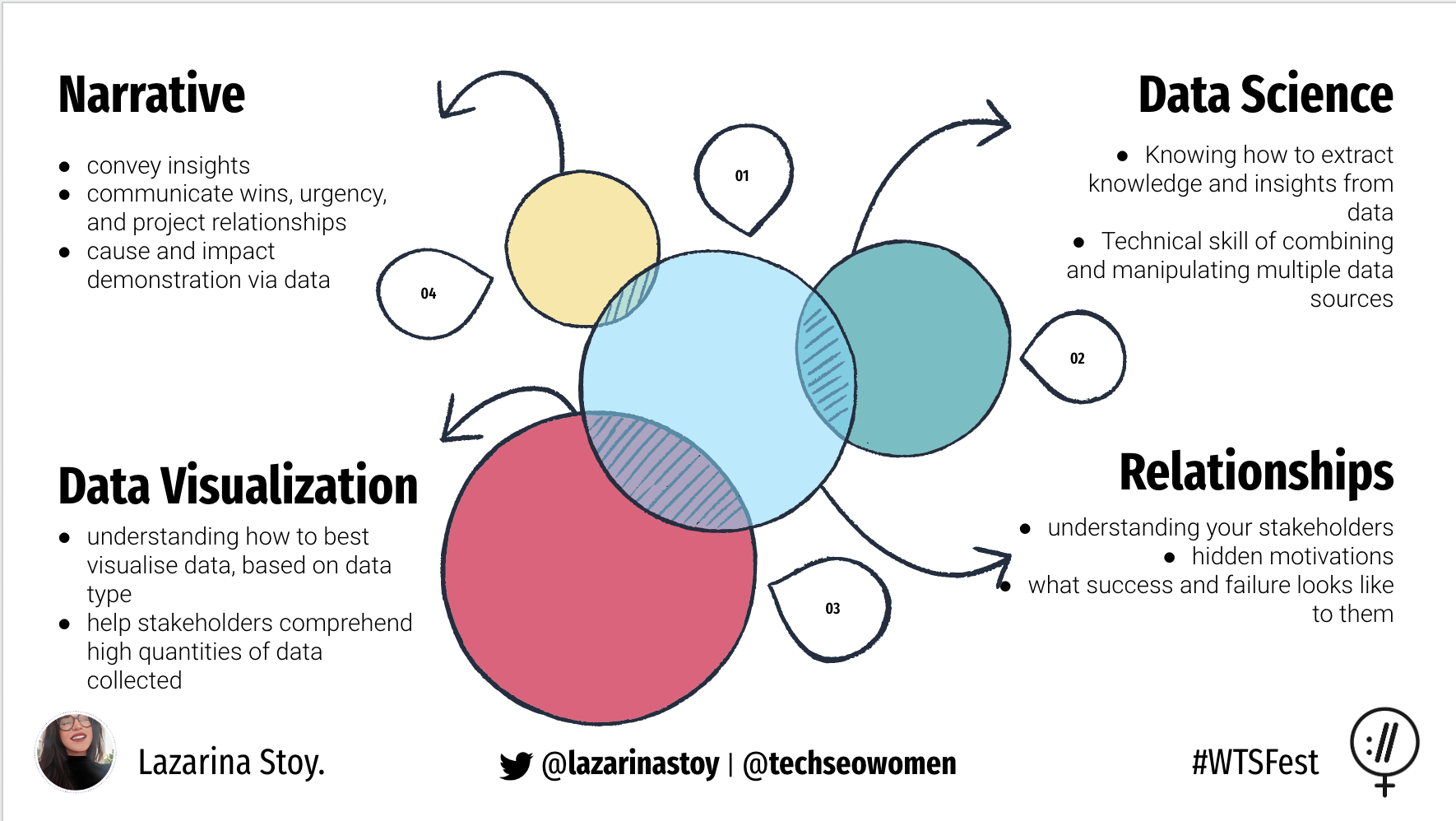
Data storytelling bridges the gap between raw data and actionable insights, transforming complex datasets into compelling narratives that drive informed business decisions. Modern dashboards leverage advanced visualization techniques and narrative frameworks to communicate complex findings to stakeholders across all organizational levels. In an era where organizations generate massive amounts of data daily, the ability to extract meaningful patterns and present them in an understandable, engaging format has become a critical competitive advantage. Effective data storytelling combines statistical rigor with human psychology, using visual elements, narrative structure, and interactive features to make data accessible and memorable. The best data stories don't just present numbers; they reveal insights, predict outcomes, and inspire action by connecting data points to real-world implications and business outcomes.

Structuring Technical Narratives
Start with clean, validated data that forms the foundation of your analytical narrative. Use ETL pipelines to preprocess and transform data before visualization, ensuring accuracy, consistency, and relevance to your story's objectives. Choose the right chart types for your message: line charts excel at showing trends over time, bar charts effectively compare quantities across categories, and scatter plots reveal relationships and correlations between variables. The key to effective technical storytelling lies in understanding your audience's technical background and business context, then selecting visualization techniques that align with their mental models and decision-making processes. Consider the cognitive load of your visualizations - complex charts might impress technical audiences but could overwhelm business stakeholders who need clear, actionable insights. Always provide context through annotations, benchmarks, and comparisons that help viewers understand not just what the data shows, but why it matters and what actions should be taken as a result.

Interactive Dashboards
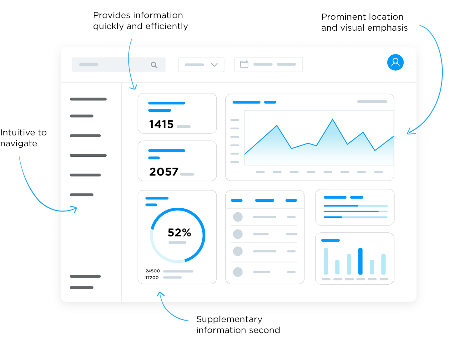
Implement filtering, drill-downs, and dynamic narratives that allow users to explore data from multiple perspectives and discover insights independently. Use modern frameworks like React or Vue.js combined with specialized BI libraries such as D3.js, Chart.js, or Plotly to create interactive experiences that engage users and encourage data exploration. Track user engagement metrics and gather feedback to continuously refine your dashboard design, ensuring that interactive elements enhance rather than complicate the user experience. Interactive dashboards should guide users through a logical exploration path while providing the flexibility to investigate specific areas of interest. Consider implementing progressive disclosure techniques that present high-level summaries initially, then allow users to dive deeper into details as needed. Responsive design ensures that dashboards function effectively across different devices and screen sizes, making data accessible whether users are in the boardroom, at their desk, or reviewing insights on mobile devices during travel.
Common Pitfalls and Best Practices
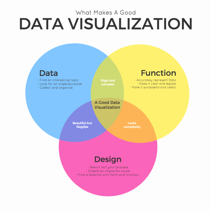
Avoid overwhelming users with too much information or complex visualizations that require extensive explanation to understand. Use color psychology and visual hierarchy principles to guide attention to the most important insights while maintaining aesthetic appeal and professional appearance. Always provide actionable insights and sufficient context for decision-makers to understand implications and take appropriate action. Common mistakes include using inappropriate chart types for the data being presented, failing to provide adequate context for numbers and trends, overwhelming users with too many metrics simultaneously, and creating visualizations that look impressive but fail to communicate clearly. Best practices include starting with clear objectives for what the dashboard should accomplish, designing with the end user's workflow in mind, maintaining consistency in design elements and terminology, and regularly testing dashboards with actual users to identify usability issues and improvement opportunities.

Conclusion
Effective data storytelling transforms dashboards from simple reporting tools into powerful communication platforms that drive organizational alignment and informed decision-making. By combining technical rigor with engaging narratives, thoughtful design, and interactive features, you can create dashboard experiences that not only inform but inspire action and improve business outcomes. The investment in sophisticated data storytelling capabilities pays dividends through faster decision-making, improved stakeholder engagement, and more effective communication of complex analytical insights. As organizations continue to generate and collect ever-increasing volumes of data, the ability to transform that data into compelling, actionable stories becomes increasingly valuable. Remember that the most successful data storytelling initiatives focus not on the sophistication of the technology or complexity of the analysis, but on the clarity of the message and its relevance to the audience's needs and objectives.